SubCenter

Zainal Sabarudin
UI/UX Designer | Illustrator


Our Purpose
Our goal here is to create a simple and accessible database to manage and view all streaming content without providing the user the experience of being overwhelmed by all the content.
Tools:

My Role:
Sketching, visual design, problem solving, user testing, user flow, user persona, prototyping.
Overview
There are many applications that help manage your streams and help measure the money spent on your streaming services, but the average consumer is still over whelmed by all the streaming services out today. SubCenter is made to alleviate that problem and I will show you how and why.
Process For Our Purpose
Discovery
Secondary research was a low-cost way for me to discover the major pain points of the target audience. There have been many surveys and polls conducted recently
Synthesize
Creating user personas was a simple and efficient strategy to generalize all common issues and pain points that i hope to solve
Design
After creating the user persona, designing the user flow would be next next step in determining the user’s process navigating through the applications
Validate
After the creating the low-fidelity design, I had enough to test out the product with participants that fall under our consumer census.
Design
After learning much from the usability test, I had a lot of work on my table to make adjustments to accommodate the participants suggestions and complaints,
Validate
Finally after the last design adjustment I conducted another usability test to perfect the design and make the necessary changes.
Act I
Act II
Act III
Act IV
Act V
Act VI
Discovery
To discover more about the pain points experienced for the streaming consumer I decided to do secondary research. Going this route would be very efficient because there is already so my research done already.
For example, Ipsos had already conducted a poll based on one a few of the many pain points of being a streaming consumer
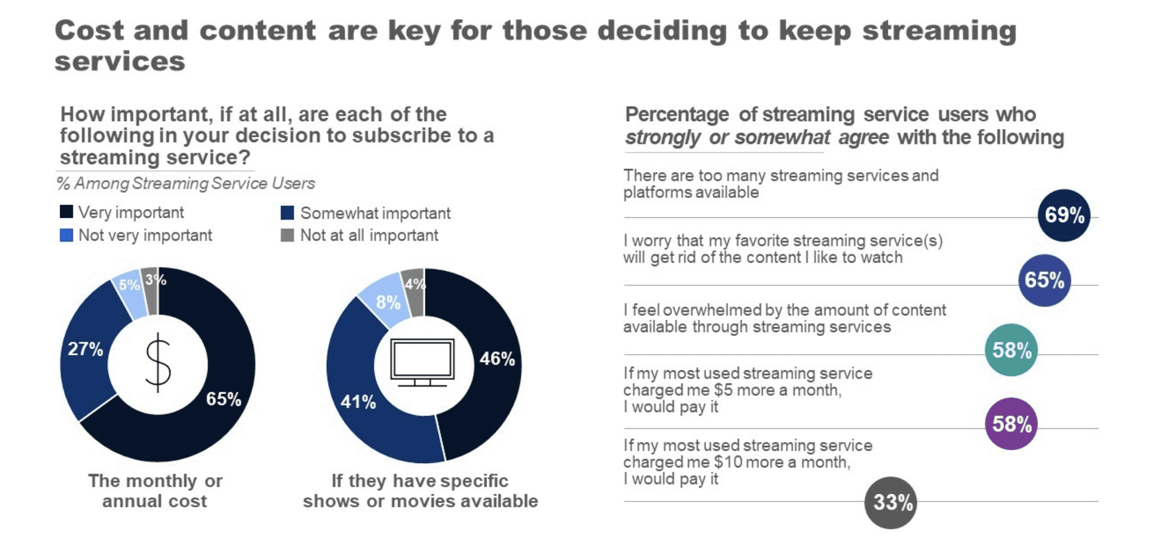
Source: NPR/Ipsos Poll conducted September 9-11, 2002
Facts about today’s way of ingesting content
Here are some of the important take aways from the Poll
“Eighty-seven percent report that whether a streaming service has specific shows or movies available is important in their decision to subscribe. Forty-six percent say that it is very important”
“most streaming service users feel that there are too many choices, and nearly three in five agree that they are overwhelmed with the amount of content available”
“When asked about the motivating factors to drop a service, the numbers closely mirror that of the question around keeping a service. Again, cost and available content are at the top of the list”
“Sixty-nine percent of streaming service users agree that there are too many streaming services and platforms available, and 58% agree that they feel overwhelmed by the amount of content available through streaming services.”
Money Vs Content
According to data gathered from the NPR/Ipsos survey, customers using several streaming platforms believe that content quality is equally vital as the cost. Simultaneously, these users experience immense saturation due to the vast content offerings. This insight drove me to develop my design while focusing on addressing these challenges.
Who is this for?
The subsequent stage involves determining the target audience, and using the data acquired from the Ipsos survey, I managed to develop a User Persona.
Bio
Joshua Ethan is a 37 year old male who shares accounts with his wife and 2 children. John doe owns 4 streaming services and enjoys the idea of choosing which streaming company he would like to subscribe to.
Frustrations
The amount of content available is overwhelming.
Navigating through the content is confusing
Are some streaming services worth the monthly subscription?
Wants & Needs
Ability to navigate through the content with ease.
Have accessibility and knowledge of the content I enjoy
Pay for only what I know I enjoy.
Service Rating
Netflix
Apple TV
HBO MAX
Youtube
Spotify
Total time spent using
Netflix
Apple TV
HBO MAX
Youtube
Spotify
Joshua Ethan

“There are too many streaming services, I cannot keep track of all my favorite content. I feel so overwhelmed”
Designing the product

User Flow
Subscription Information
Show content for selected streaming service
Price
Includes upcoming shows
includes cancelled shows
Reports: Time/money spent
Show payment days as calender
SIGN-IN
HOMEPAGE
Subcriptions page
Reports
Payments
ACTION
PAGE
What is shown in the page
Layer
View all subsribed Services
Cancel Subcription
Search Show
Provide pay notifications
Select Sub
Select Sub
DASH
Subs
Reports
Calender
Checking
$6,112.30
Notifications
Netflix
Apple TV
Payment due in 2 days
Payment due next week
Content Updates
New episode of
New episode of Shadow and Bone
On Netflix
New episode of
Search
SubCenter
Netflix
$15.49
AppleTv
$15.49
HBOMax
$15.49
Spotify
$15.49
Youtube
$15.49
PSN
$15.49
Amazon
$15.49
DisneyPlus
$15.49
Netflix
$15.49
Netflix
$15.49
Netflix
$15.49
Netflix
$15.49
Netflix
$15.49
Netflix
$15.49
Netflix
$15.49
Netflix
$15.49
Netflix
$15.49
Service
Price
Autopay
Subscriptions
DASH
Subs
Reports
Calender
Search
SubCenter
Money Report
Time Report
DASH
Subs
Reports
Calender
Netflix
HBOMax
Apple TV
Youtube
Disney+
$26
$24
$22
$20
$18
$16
$14
$12
$10
$8
$6
$4
$2
March 2023
TV/Series
Other
All
Search
SubCenter
Money Report
Time Report
DASH
Subs
Reports
Calender
March 2023
Time spent logged in
Netflix
Apple TV
HBO MAX
Youtube
Disney+
TV/Series
Other
All
Search
SubCenter
DASH
Subs
Reports
Calender
April 2023
Sun
Mon
Tues
Wed
Thu
Fri
Sat
2
3
4
5
6
7
9
10
11
12
13
14
16
17
18
19
20
21
23
24
25
26
27
28
30
Search
SubCenter
SubCenter
Netflix
Apple TV
HBO MAX
Spotify
Youtube
PSN
Amazon
Disney
Cancel
Complete
Low Fidelity Wire Framing
Here are the low fidelity screens of pretty much the main route the user would need to navigate through the Subcenter app. At this stage the user can look at updates, select subscription services, view calendar, and add their banking and checking account information.
From here, I have designed enough of the product to test out with some participants. So I requested 5 individuals who manage multiple streaming services to test out my design as well as share their thoughts on the purpose of SubCenter
Usability Testing Highlights
Macy “I don't like how the application requests for your checking and banking information from the beginning, It seems a bit daunting and personal
Haifa “I would like to know the point of the search bar. It does not provide too much explanation of what I would like to search. Maybe needs a bit of guidance.
Josh “The graph in reports seems impractical, I don’t think there is a need to show every months payments if the streaming service price rarely changes.
Sonny “I love the idea of having all streaming services in to one centralized application so I don’t have to move from service to service to decide what to watch.
Changes after usability testing
Obviously my low fidelity design was not perfect. Changes were needed, but I learned a lot more than I thought I would.
DASH
Subs
Reports
Calender
Checking
$6,112.30
Notifications
Netflix
Apple TV
Payment due in 2 days
Payment due next week
Content Updates
New episode of
New episode of Shadow and Bone
On Netflix
New episode of
Search
SubCenter
Netflix
$15.49
AppleTv
$15.49
HBOMax
$15.49
Spotify
$15.49
Youtube
$15.49
PSN
$15.49
Amazon
$15.49
DisneyPlus
$15.49
Netflix
$15.49
Netflix
$15.49
Netflix
$15.49
Netflix
$15.49
Netflix
$15.49
Netflix
$15.49
Netflix
$15.49
Netflix
$15.49
Netflix
$15.49
Service
Price
Autopay
Subscriptions
DASH
Subs
Reports
Calender
Search
SubCenter

DashBoard

Extraction
Coming June 2023


Shrinking
New Episode Friday

Shadow and Bone
New season streaming now
New episode of

The Last Of Us
New Episode Sunday
Watch List
SubCenter
Search
9:14

Notifications
Netflix
Due 1st
Apple Tv
Due 14
Netflix
Youtube
Apple TV
HBO MAX
Spotify
Playtion Plus
Amazon
Disney
Spotify
Spotify
Spotify
Spotify
Spotify
Spotify
Spotify
Spotify

SubCenter
Cancel
Complete
9:14
When making the usability adjustments, it was a great opportunity to add aesthetic changes as well.
One of the main suggestions from the participants was the idea of the graph in the report tab, He thought it was impractical to put the price for every month because the price rarely changes
Money Report
Time Report
DASH
Subs
Reports
Calender
Netflix
HBOMax
Apple TV
Youtube
Disney+
$26
$24
$22
$20
$18
$16
$14
$12
$10
$8
$6
$4
$2
March 2023
TV/Series
Other
All
Search
SubCenter

Money/Time

Time Report

$20
$18
$16
$14
$12
$10
$8
$6
$4
$2
January 2023
0
2h
4h
6h
8h
10h
12h
14h
16h
18h


tv

SubCenter
Search TV, Movies, Services
9:14

Reports
The adjustment made was implementing a price x time spent graph that shows the price of the stream in relation to how much time spent logged on to the streaming service
SubCenter
Bank
Checking Number
Routing Number
Cancel
Continue
One of the main issues many testers had with my design is the fact that the application requested for personal information from the beginning, This felt very daunting to the testers so i needed to come up with an alternative.

Select Payment
1234-5678-9012-3456
Add new card
+
Cancel
I created a change in the payment feature to provide options for the user and the application did not request personal banking information until absolutely necessary.
FInal Design Kit
SubCenter
UI ELEMENTS
Big Button
Big Button
Big Button
Big Button
Button group
Button group
Button group
Succuess
This is a test to warn the user of a accomplishment or confirmation!
Warning
This is a test to warn the user of a mistake or error!d sfaf
Cards
Here is an example of a card for the application
Profile
Security
Menu
OFF
ON
Decline
Input error
Fonts family
Urbanist
a b c d e f g h i j k l
m n o p q r s t u v x y z
A B C D E F G H I J K L
M N O P Q R S T U V X Y Z
Header and body
This is the Title Size and Weight. 30px semibold
This is the Header Size and weight. 25px semibold
This is the label size and weight 20px regular
This is the body size and weight. 18px regular
Primary, Secondary, Accent
Grays
Reds

SubCenter
Search TV, Movies, Services
9:14
Streamed total of 60 Hours so far
Netflix
AppleTV
HBOMax
Youtube
Prime
Disney Plus
Spotify
Peacock
Final Design After Another Round of Testing
After the first round of adjustments I did a second round of usability testing having 5 participants and bringing back 3 from the last session.. Overall the returning participants loved the adjustments and didn't too much to add after. Here are the minor adjustments and final design

The Main design was too distracting, with too many gradiant colors. I chose to make less gradients or none at all so the user can focus on the advertised content.
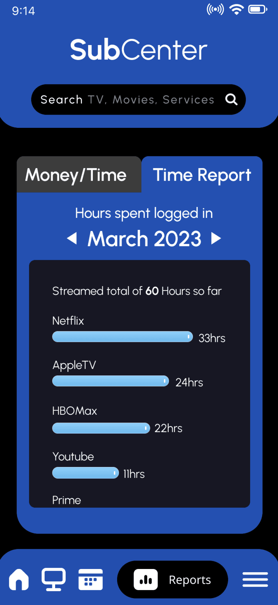
All participants loved the idea of having the amount of time spent on each service so that they can compare with other services.
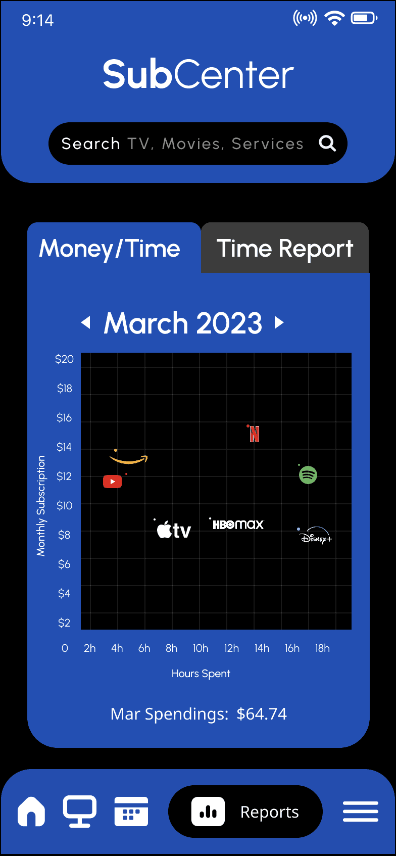
One suggestion from a tester, was that the logos on the graph did not pin point accurate data, They suggested to add dots show exactly where they streaming service is in the graph

By clicking on a specific date you can get basic information on whats due, One participant suggested that I put some of that information at the bottom since there is some empty space.

A lot of the participants loved the idea of getting updates on content before deciding to continue or cancel their description.

Another great feature they loved was going to the category and viewing all the categories from different streaming services.

Finale
To summarize, the low-cost and efficient strategies I conducted to arrive at the idea to design a product to centralize aIl streaming services was a success. I am confident that I created an optimal product that is designed to keep streaming consumers less overwhelmed and the option to have all their services accessible. With SubCenter they are able to navigate and manage through all streaming services without moving from one service to another.