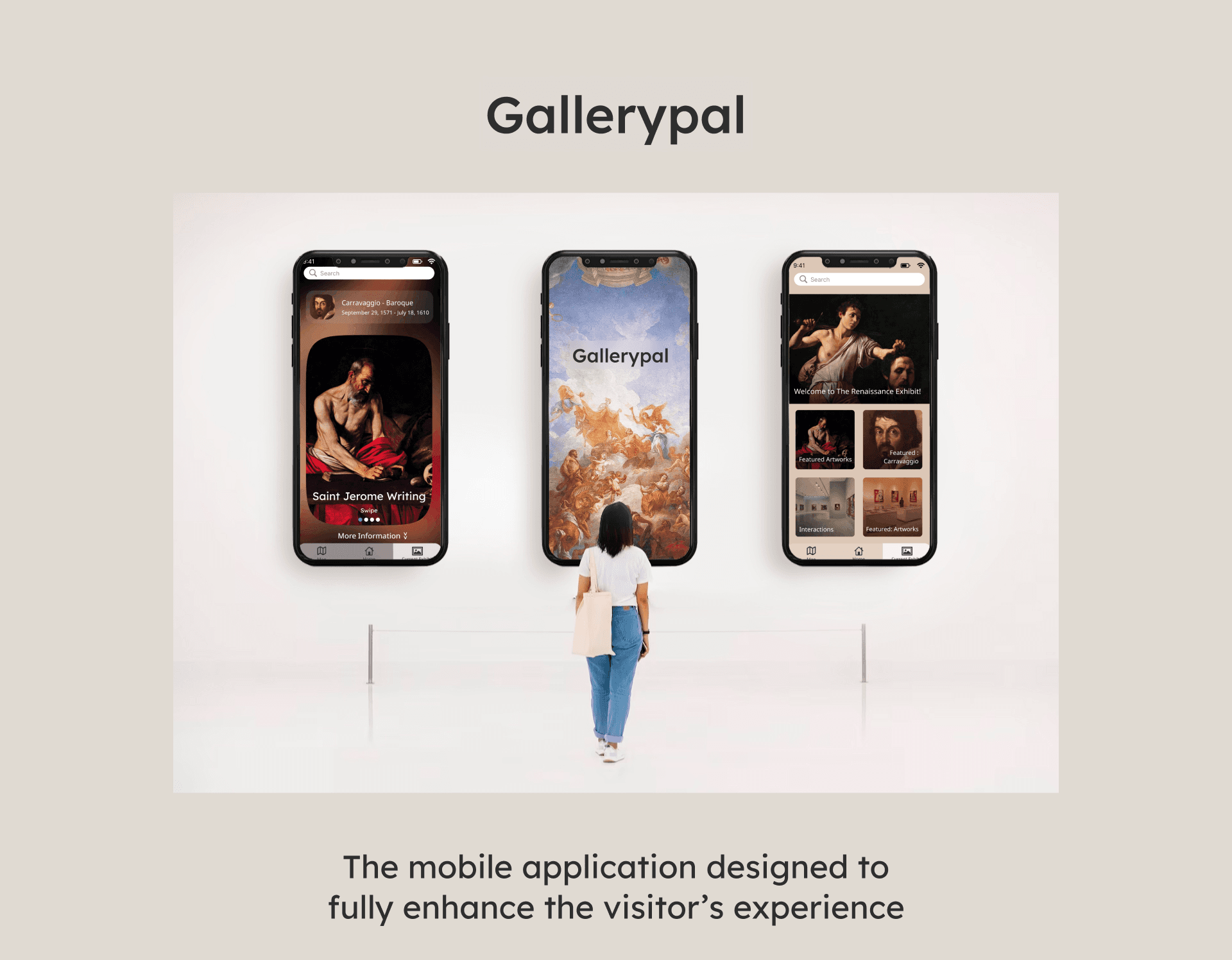
The mobile application designed to fully enhance the visitor’s experience


Zainal Sabarudin
UI/UX Designer | Illustrator
Tools:


Scope & Constraints
This project I completed is a modified Google Visions design sprint that was created to showcase design and problem solving abilities, provided by Bitesize UX
Timeline:
5 days
My Role:
Sketching, visual design, problem solving, user testing, user flow, prototyping.

Overview
Gallerypal is an interactive application that tracks the user’s location to provide the user information as they explore each exhibit. Gallerypal acts as an mobile tour guide for the user for the purpose of enhancing the overall museum experience.
Our Goal
“Sometimes I’ll do a quick Google search for a painting while on my phone while at the museum... but I usually just find long articles that are super overwhelming..”
-Nick
Museum goer
Museums and galleries are trying to increase customer satisfaction when viewing art
Based on the information obtained. Most guests want different information .
More quotes from visitor interviews...
I want information straight from the artist themselves. - Liza
I don’t like tour guides, I prefer to explore on my pace. - Ryan
I enjoy more back ground information - Ana
GalleryPal aims to solve the visitors’ issues...

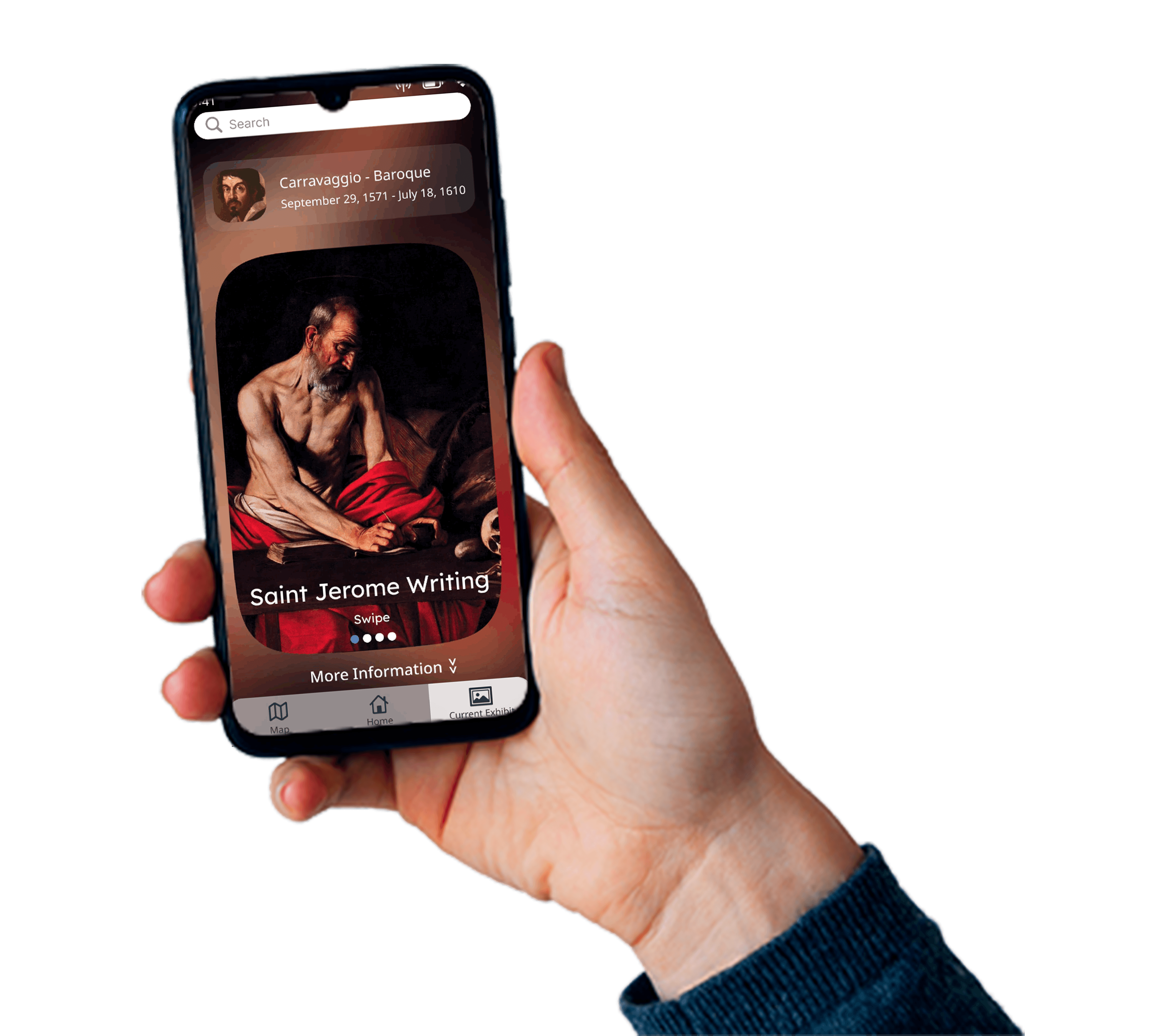
How does it work?
As the user explores the museum, they get notified whenever they enter a exhibit. That notification informs the user where they are currently at and what pieces of art the exhibit contains. In addition, Gallerypal provides detailed information for each artwork and artist that is showcased!
How did we get here?
The strategy used to find the solution was the design sprint process. A design sprint is a fast and cheap approach to bring a product to the market
- Design Sprint

Design Sprint Schedule
Map
Monday
Sketch
Tuesday
Decide
Wednesday
Prototype
Thursday
Test
Friday
Map
MUSEUM
Open App
Scan QR code at entrance
App opens artist info
User chooses different info
Choose Audio or video
During this stage, I jumped right into imagining a possible solution by using post it notes. I drew an end to end experience for the user with Gallerypal in place to enhance the experience. Originally I had the User scan a QR code to obtain information, but later changed the idea into a tracking feature instead.

Sketch

Crazy 8’s
Creating the UI was no masterpiece. I had to design something that would not distract from any original art piece. That is why sketching a was vital

Solution Sketch
This solution sketch shows the same idea of informing the visitor of every exhibit’s content, but at this time I was still using the QR code or bracelet idea. I later decided to scrap both and use the phone’s tracking system to locate the vistor.
Decide

Story Board
On Wednesday, it was time to finally decide how the application would look like and determine the real solution. My decision in the end was to design an application that showcased the artwork. The solution came down to the visitor receiving notification whenever they would enter the exhibit. In addition, I thought it would be helpful to add a map feature to help guide the visitor around the museum.

Prototype
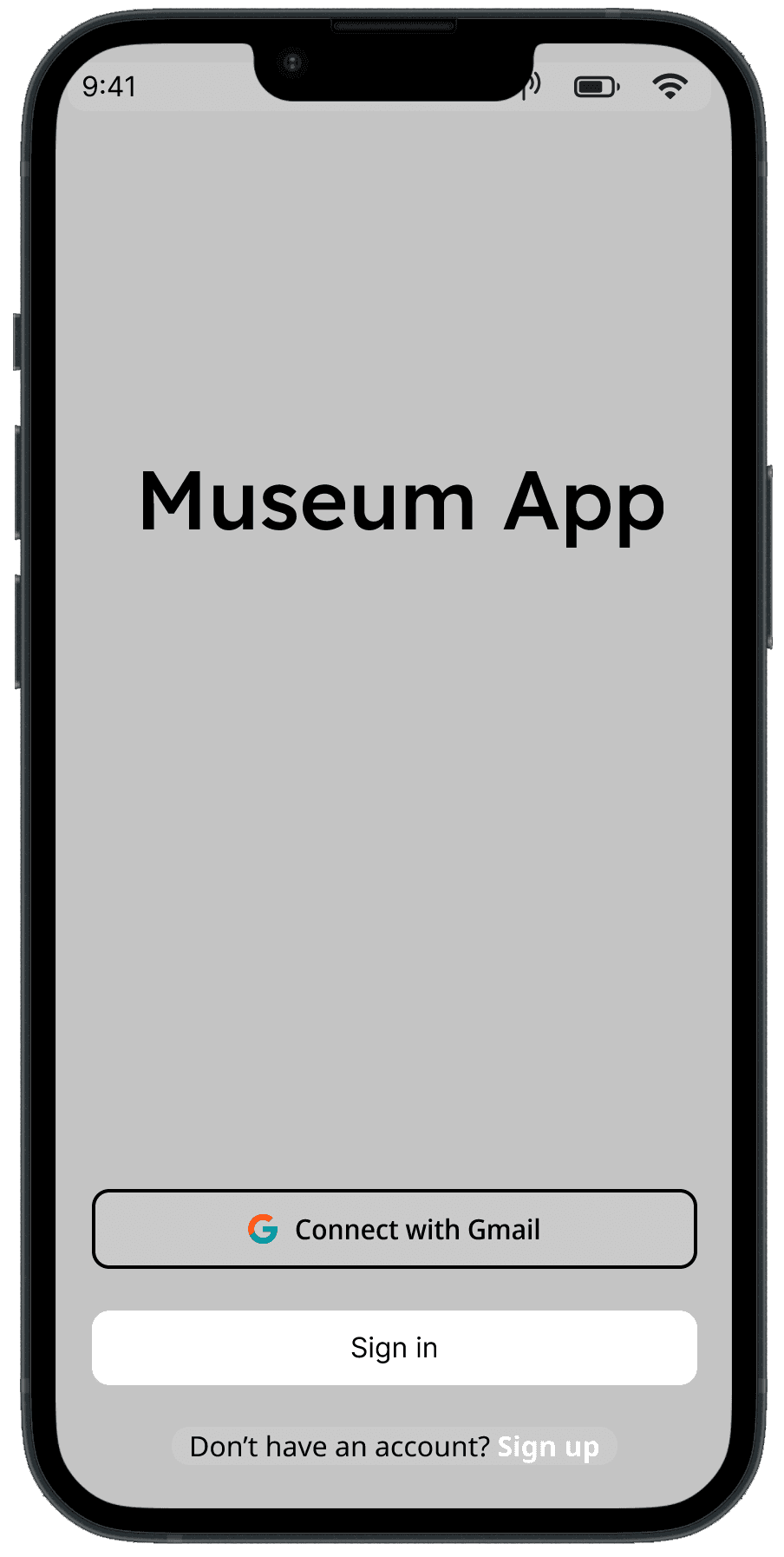


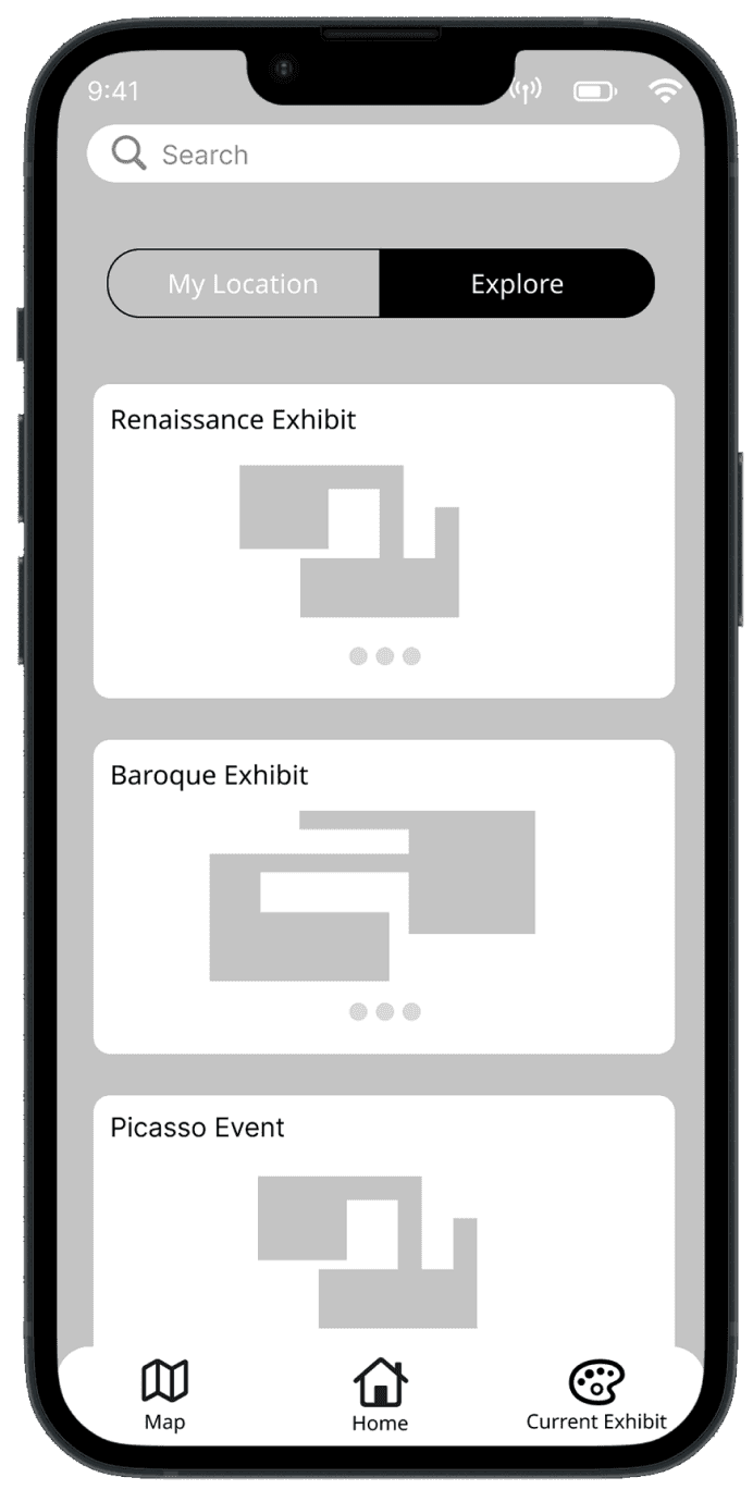
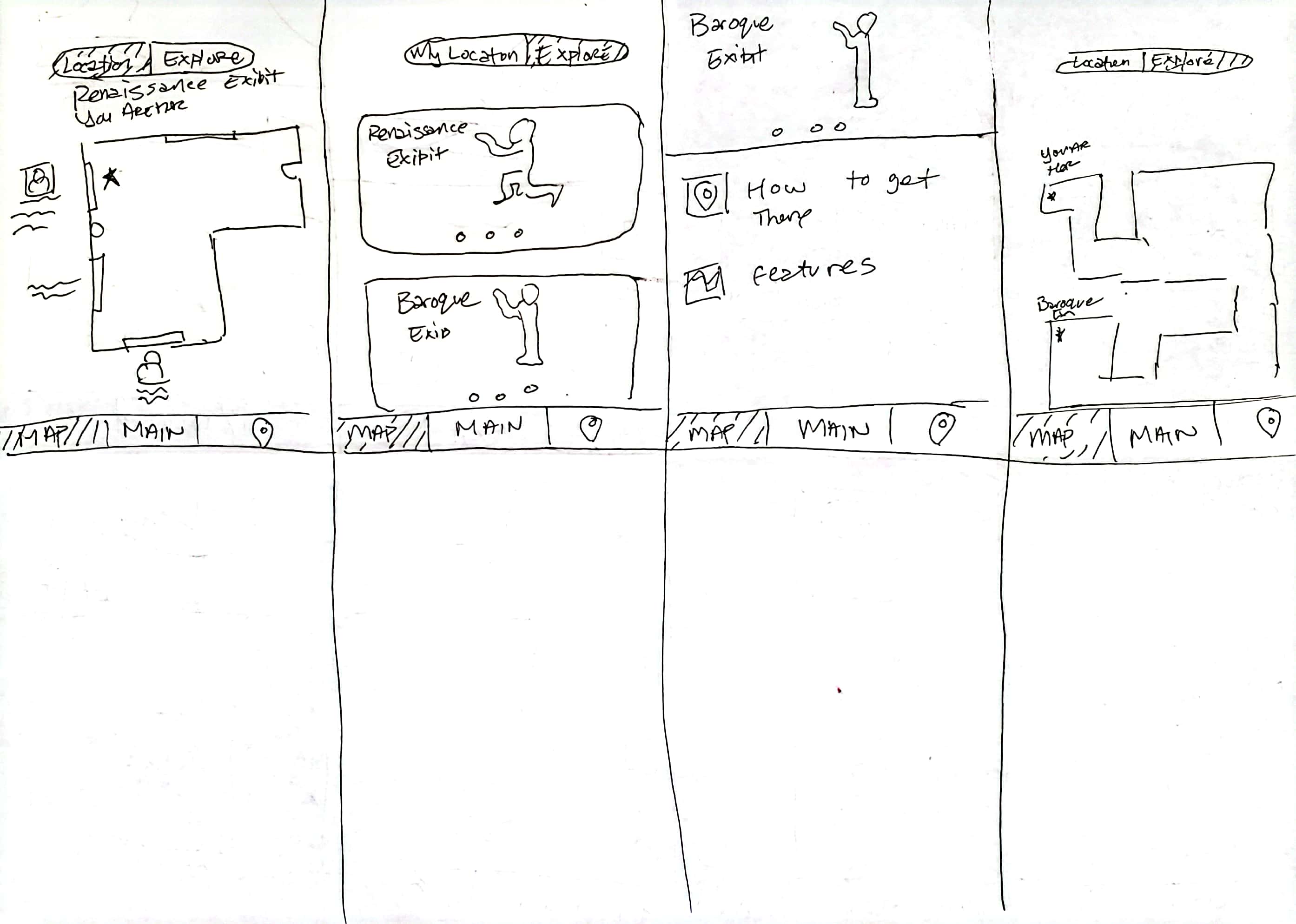
Low Fidelity
The nex step in the design sprint is to prototype. Here is the low fidelity stage. My goal was to make sure the artwork that is showcased is fairly represented.


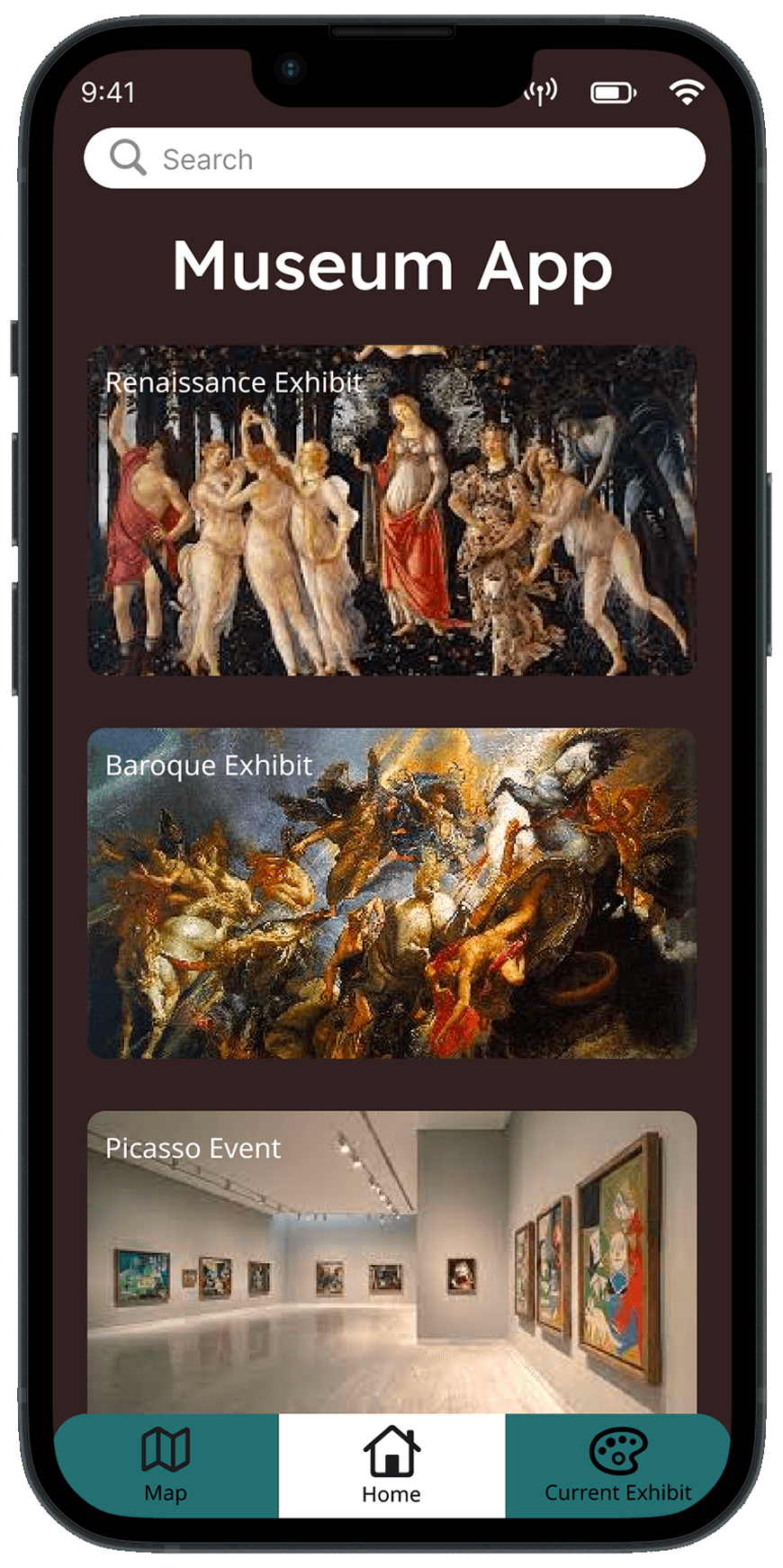

High Fidelity
During this stage the colors and the featured artwork of the museum was placed within the low fidelity. Unfortunatley, at this stage the Gallerypal is not complete. It still needed to be tested
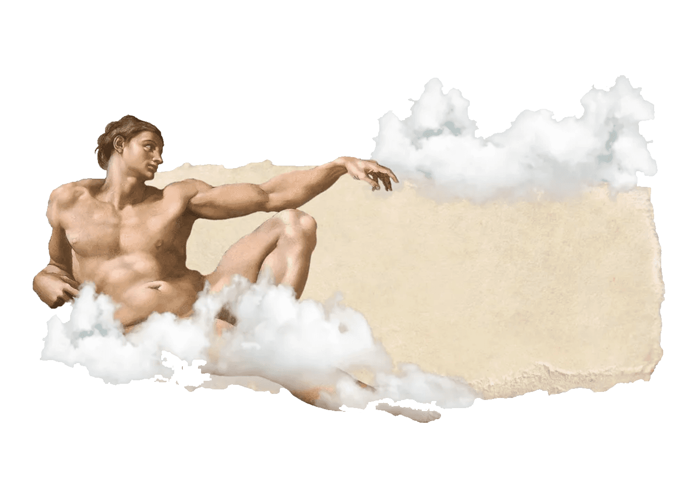
After the usabilty tests, I realized I needed to make a lot of changes. Like Adam, I am a human, and it was natural for me to make mistakes a long the way.
Test
It is Friday, the last day of the design sprint. This is where Gallerypal goes through the usability test with 5 participants and I obtain vital information that can vastly improve the application.

What I learned
Even after trying to showcase every artwork It still seems the UI distract from the featured pieces. So need to go even further to make sure the art was the center of attention.
Failures

Covering the artwork

Background colors do not advertise the art

Distracting color schemes
Triumphs
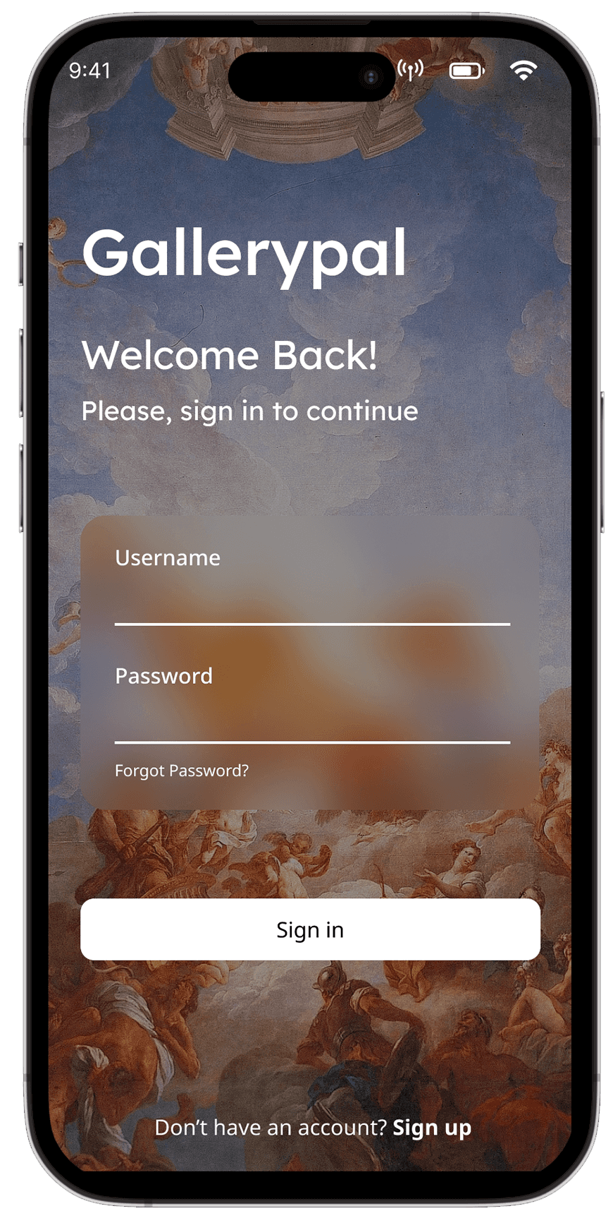
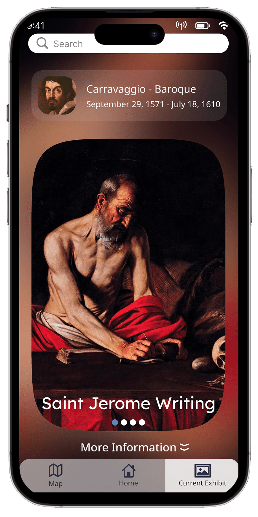
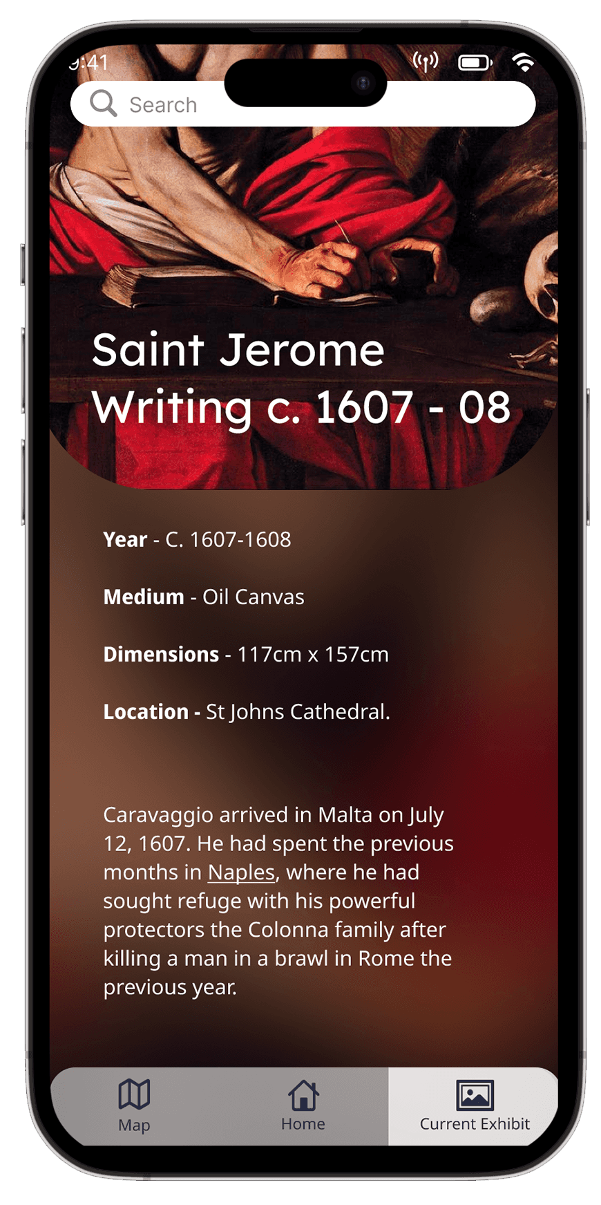
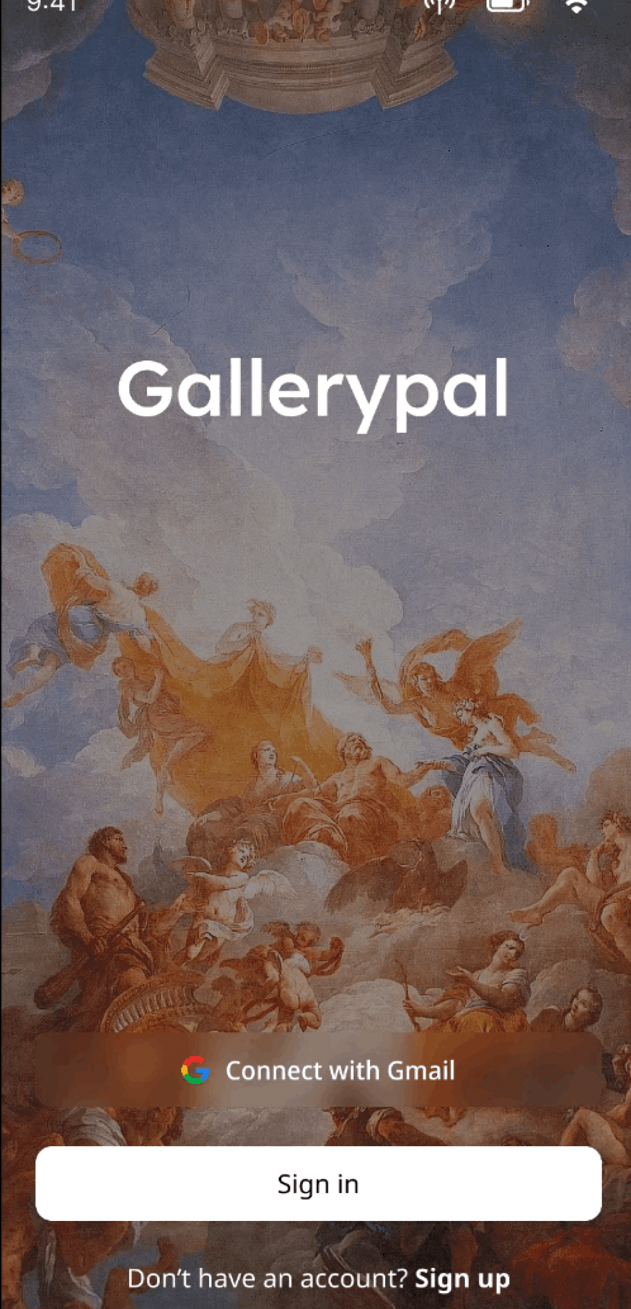
It was my decision to extend the focus of the art pieces even further by enlarging pieces into the center and the art piece as a background.
I feel the information that is provided to the user is more accessible and can be shared for every piece the artist has showcased.

Finale
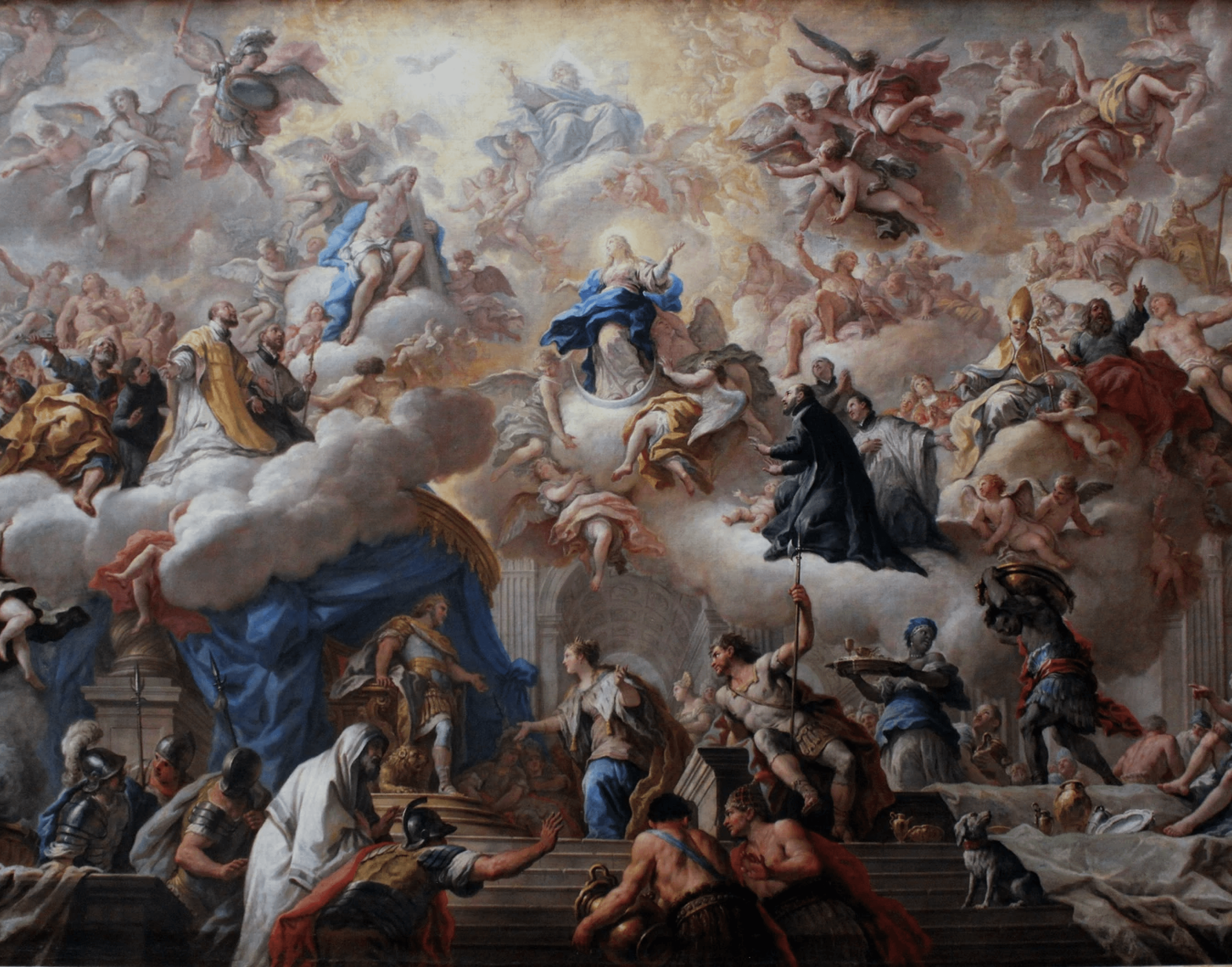
After the trials and tribulation, the finale product focuses on the art pieces, as well as provides information the visitor will better appreciate.

Reflections
The design sprint focusing on Gallerypal is a fun and quick take on user experience design. I feel that I learned I am capable of acquiring data in a short period of time if I set a specific schedule based on the design sprint. I also gained an appreciation for each step/day of the design sprint.

What is next?
Given my constrictions and time frame, I believe there was not an opportunity to test this product with individuals with disabilities or handicaps. This product should be accessible to anyone who appreciates museums and art.
